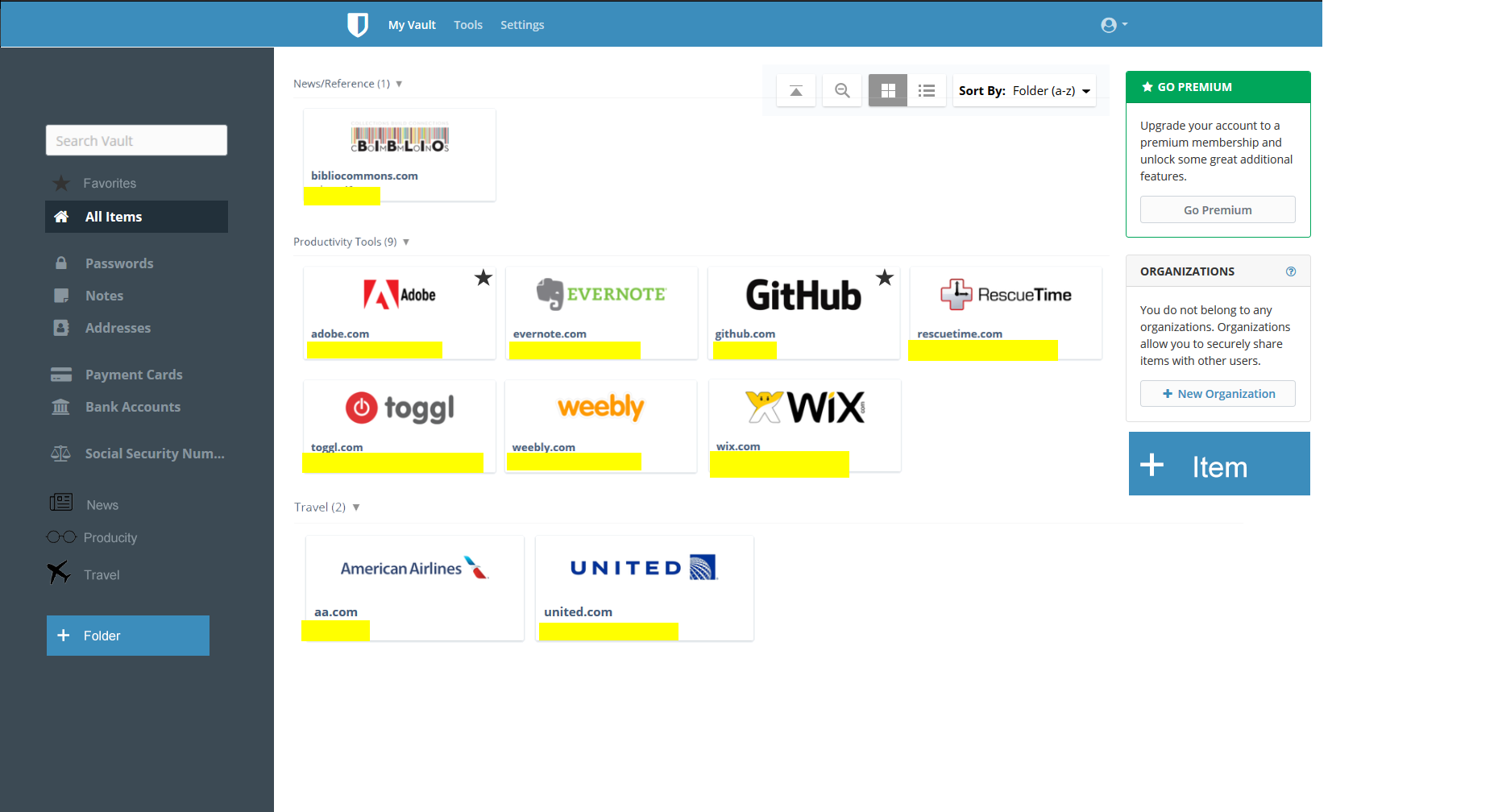
5 min mock-up using some lastpass visuals. This is an example, don’t take it too seriously.
-
Make icons easier to view with a grid view. Visuals are faster than words.
-
And please use more screenspace. Right now everything is in a list that’s hard to see and search, use what space you have to make it faster for me to get to my data.
-
If I’m viewing all items if you could break up like-items with a divider that would be nice or give me the option as a filter. Seeing a long list of items just feels disorganized to me, if I don’t remember exactly what that site did (Which is often the case as I test a lot of tools, having a way to have everything divided is nice. I know I can go through all the folders along the side but it does require extra steps on my side).
I’m not saying we should get rid of list view, I just think having a more visual option would be nice too.
I would post more pictures but I’m a new user.