I’m pretty sure Bitwarden of all companies knows the compact version of a product should increase the information density by more than literally a dozen of pixels, Grb ![]()
2 Likes
I’m not part of the Beta program so pardon me if I should not be posting to this thread… but the comments so far scare me, frankly.
Please (BW) keep this in mind - just because you can do some fancy UI eye candy, does not mean that you should.
4 Likes
It’s everytime there’s a revamp
What eye candy scares you? If you are able to describe your fears in words or pictures and with a bit of precision, Bitwarden might be better positioned to take action.
This is an open beta. Fee free to install it, take it out for a test drive and offer specifics about what you feel could be done better. The only real trick is to only have one extension active at a time (so it is easy to tell who is doing what).
I, for one, am happy to see Bitwarden accepting feedback regarding spacing/padding, such as changing the word “autofill” to “fill”, and introducing compact mode as an option. I also remain hopeful for “saved searches” and “sort by” to further increase our ability to make it work well for our own individual preferences.
I strive to be more of a glass-half-full guy (its a work-in-progress). In this conversation, I see Bitwarden actively soliciting feedback, users responding constructively, Bitwarden reviewing everything and incorporating that which fits-in. This is a much welcome improvement compared to my much bigger and (as they call themselves) “important business partners”.
3 Likes
All good points, and perhaps I was taking a less-than-positive approach. And you’re correct in that it seems Bitwarden is taking the feedback seriously which is good to see.
1 Like
So this means that I need to click on potentially several password posts just so I can see what system the password is for.
I know that the URI field is there to help sort stuff out, but that only works in the browser extension and with browsers. If I need a password for remote desktop or an ssh-session I’m going to look/search manually.
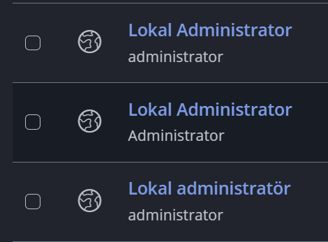
Which one of these is the admin for my Confluence instance and which is for our Ticket system?
Could name each one:
Lokal administrator - confluence
Lokal administrator - ticket system
Or
Confluence - Lokal administrator
Ticket system - Lokal administrator
3 Likes
I could do that, but then I wouldn’t need the folders or collections would I?
Also with how tight things are I wouldn’t want to to have the names be even longer for something the GUI should show me anyway.

In the current GUI the names don’t even show up. Meaning I have to hoover over them before I know which one is which
![]()
1 Like
Folders could actually help you, because you can easily filter by folder (so that the search results exclude any accounts not in the relevant folder). You can also easily filter by collection, but please note that collections are not really for the purpose of organizing vault contents — they are for the purpose of configuring access permissions. Your 3 local admin accounts only need to be in separate collections if some of your organization members should have access to only 1–2 of the accounts, but not all three.
The solution suggested by @Gerardv514 is really the best one for your use case.
Putting the collection information in the GUI will take up as much room (or perhaps more) than putting it the item name, so I’m not sure I understand your point.
There have been changes, good and bad, to the UI. Depending on what the final UI design will look like, you may or may not need to use item names following the second pattern suggested by @Gerardv514 (e.g., Confluence - Lokal administrator).
This is how the new UI looks (in comparison to the current UI), and a rendering of how the new UI might look after the Launch icon is returned:
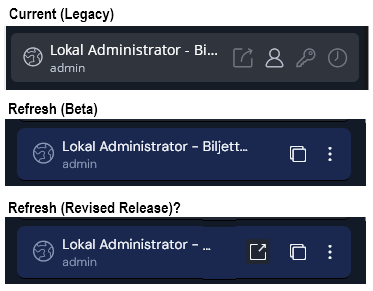
@Kevin_Harris from Bitwarden has promised that a “Compact Mode” option will be made available, which should be able to display more information than the examples above.
You already show administrator as a username so maybe shorten the title. Just put the service name and then LAdmin (for Lokal admin) or just ServiceName - Admin
basically no one outside of tech knows what a URI is. I see no reason to use a technical term rather than an extremely recognisable term, even if it’s slightly less precise.
Even when “website” makes no sense if you are setting up a login item for autofilling a mobile app?
If a user is manually extracting the app package name by copying the app link, appending “androidapp://” to it, and inserting it into Bitwarden, then yes, I believe it’s still a much better option than an obscure tech acronym because that specific user is a power user or at least tech-savvy.
If the user isn’t doing that manually and instead using the autofill service to create a new item, they will see it’s an app from the androidapp:// part, and will likely never pay attention to it because it’s created by Bitwarden.
That said, I’m sure there are better naming options for mobile apps, but between having URI everywhere and website everywhere, I’d pick the latter.
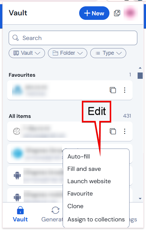
One of my most common workflows is to modify a vault item. Change a password. Add a note. Fix a URL.
It takes many clicks to get into edit mode. This is one of my beefs in all of the apps.
How about adding an “Edit” option on the overflow menu?
While on the topic of menus… I like the auto-fill suggestions feature. But why is that overflow menu different from the regular one? Please make them consistent.
2 Likes
+1, I also found this annoying
A workflow that I find highly unintuitive (aka annoying) is when filling out a payment form, for the times where auto fill isn’t used and having to manually type card number , exp, security code. You land on the form, then click the browser extension and navigate or search to the appropriate card. You then copy the card number but then realize, ahh I should have popped this window out first cause as soon as I paste the card number the extension will close.
Allow the pop out button on all screens of the extension and not just the main. Or for all card related searches persist the card screen until manually closed.
Thank you for your feedback and participation in the UI preview!
How about adding an “Edit” option on the overflow menu?
We have this one in the backlog already; thank you for the suggestion!
why is that overflow menu different from the regular one?
The top 3 actions in the standard overflow menu are removed when an item shows as an Autofill suggestions since:
- the “Autofill” badge button is available directly on the items in this section so that the user doesn’t need to open the menu to autofill the item
- the “Fill and save” action, autofills and saves the current URL to the login. If an item is appearing as a suggestion that means the URL has already been added to the item so if the action was available, duplicate URLs may be saved to that login.
- the Launch website action is also hidden since the user is already on the website saved to that login.
Hope this clarifies the difference in menu actions for you. Let me know if you have additional feedback on the menus.
2 Likes
Allow the pop out button on all screens of the extension and not just the main. Or for all card related searches persist the card screen until manually closed.
The pop out button is available on all screens of the extension in the beta preview; please let me know if you are not experiencing this.
In addition, we are planning to persist the last visited page when the popout closes (not currently available in the beta preview but coming soon). This should make the workflow you mentioned even easier as it will keep the Card open even if you forget to use the pop out button.
3 Likes
Woohoo; thank you!. Presuming this is in response to “Persistent Bitwarden UI and maintain unsaved data”.
2 Likes
I don’t think I am seeing this. In the Beta app if you click on the view button of a Card, the view item screen opens and then it covers the pop out button.
1 Like