Better use of the web extension pop-up screen space

Hi,

I migrated to bitwarden a couple of months ago and it is absolutely brilliant. The premium version I use is very reasonably priced, so I’m really pleased I decided to migrate from LastPass.

But I think there are a couple of ways bitwarden could be more efficient.
I would suggest two things but, although they’re both usability features, they’re different, so I’ll present them in separate posts for clarity.

This one is about better use of screen space.

Currently, if I want to use the bitwarden extension to launch a protected web page, the extension shows me the login for the current tab (if relevant) and then identities (or nothing, as per user configuration), while 99.9% of the time, it’s my vault I need to access …

Let’s take a practical example for the sake of clarity. I’m on my amazon web account and want to launch my ebay web account.

Current Process

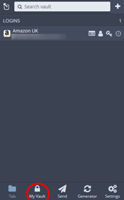
When I activate the bitwarden extension, it shows the login info relevant to the current (amazon) page… and nothing else, which I think is a waste of screen space.
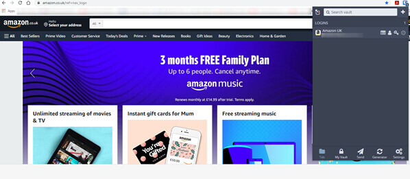
image

I then have to click on “My Vault”…
image

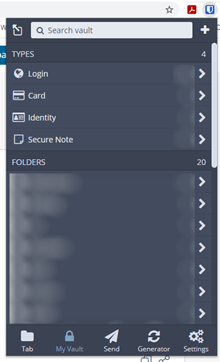
To access my favourites / folders
image

Where I can finally select/launch my ebay account.
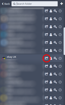
image

Suggested Process

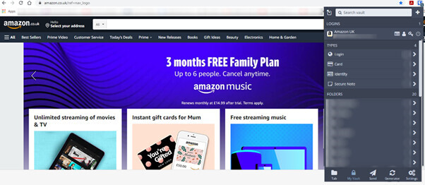
When I activate the bitwarden extension, it shows the login info relevant to the current (amazon) page, AND my vault…
image

From where I can directly use the launch button to start my ebay page/account.
image

Note: It’s even worse if I am on an unprotected page without relevant login.

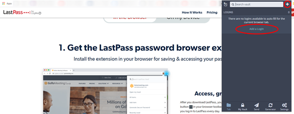
I currently get this when I activate the bitwarden extension:
image

Where “Add a login” is pretty much useless, as the “+” icon does the same job, and the bulk of the pop-up space is unused.

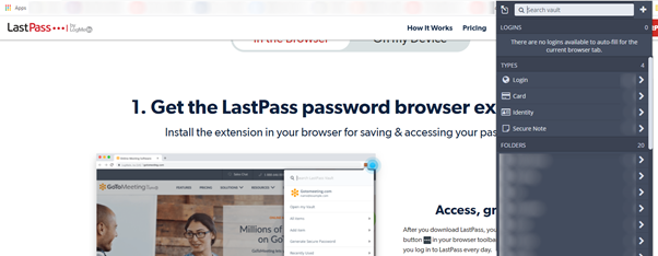
Again, I’d rather have all this space utilised like this:
image

So, I can directly access what I use most…

I hope it all makes sense…

This, given the extension is a tool that’s used quite a lot in the day, would, in my mind, make the experience much better. I also don’t think (although I’m not a programmer, so could be wrong) this would be very difficult to implement.

Thanks for your attention and possibly support to get this up the list of developments. :+1:

I understand your idea, but from my point of view Bitwarden is not a bookmark manager. Instead it’s a password manager. I do not know if it is just me, but I would never go to Bitwarden to look for and to launch a web-page.

1 Like

I agree a bit with phil.
Too big, too large, too many useless “title/text”, a small text tip could appear above the icon by leaving mouse pointer over it.
On example: Generate PW and Copy PW into something like :arrows_counterclockwise: and :clipboard:
May I recommend using icons, a subset of fontawsome or similar is enough.
Some designs have been proposed (one for mobile by a girl from eastern-europe, which is great).

Agree also with another post, that the red circle with the number of login is useless and the colour is counter-intuitive: red=bad green=ok

Another example, 5+3 lines just for these:

Length 15 — A-Z — a-Z — 0-9 — !@…*
Min digits — Max Symbols — Avoid Ambiguous

Could become something like (good fonts and icons not available in this forum)
[15]_ [x]A [x]a [3]0-9 [1]% [ ]0OoLlIi1!

An user-defined exclude characters field would be welcome
[ @ / £ € ]

2 Likes

Bitwarden IS my bookmark manager for sites where I have passwords saved in Bitwarden. In fact, the saved links in Bitwarden are the only ones I use to get to those sites. I have as many bookmarks in it as I do in the browser, maybe more.

3 Likes

Bitwarden IS my bookmark manager for sites where I have passwords saved in Bitwarden. In fact, the saved links in Bitwarden are the only ones I use to get to those sites. I have as many bookmarks in it as I do in the browser, maybe more.

thanks!
well, at least, I’m not the only one, then! :+1:

1 Like

I got your point.

To summarize, It seems as though combining the “tab” and “my vault” is what is being proposed. I assume this includes bringing the “tab” options of show/hide cards and identities to the “my vault”.

I do not know if what I say next justifies as an extension of this proposal or new features in and of themselves. Allow more customization of the resulting “tab/my vault” through more options to show/hide various types and categories. Also, allow display of the various categories as a more compact “collapsed state” by default like top level folders or types are now or expanded as an option. Re-ordering the top levels would be icing-on-the-cake.

1 Like