The new design is too edgy, outlines are too contrasting, components are mismatched in sizes, and there are like 4 different radius. If a designer was engaged to do this, I would seek a rework or refund, what was the goal of this big bang refresh anyway?
I’m more a functional guy, so designs usually don’t irk me that much, but I agree it feels like a step backwards.
Over time, I learnt not to do 3 things: big bang approach (waiting and waiting until it is 1 big humongous change), rewriting from scratch and support 2 versions in parallel.
Luckily there is only 1 version in this case. Big bangs usually lead to reactions like what we have now, and rewriting from scratch (which I think this also qualifies for) loses ALL the fine tuning and adjustments that were accumulated over time.
This creates unnecessary friction between users/devs and depletes the trust that was painstakingly built up over time.
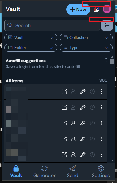
The one bigger upside is that, finally I can filter down my long list of google accounts to fill, where in the past, I always had to scroll through that long unsorted list.
Please vote to to have Click items to autofill on vault view ticked by default here Make "Click items to autofill on Vault view" the default